Anijah Mclaurin


A San Francisco based multidisciplinary designer specializing in UX/UI, web design, game development, print, and publication design.
I am a designer based in San Francisco who has completed a Bachelor of Arts in Design with a minor in Media Studies at the University of San Francisco. My practice spans web design, game development, print, and publication design, with a strong focus on visual storytelling and interactive experiences. I draw inspiration from nostalgia, fashion, archival history, and activism, using both personal memory and collective cultural narratives to inform my work and creative process. I aim to create work that sparks meaningful conversations, with a belief that design has the power to shape how we feel, connect, and understand the world around us.

Accordion Book - Stussy cover
SPRING - 2023
ACCORDION BOOK- 3 x 4.5 inches each (18 PAGES)
ADOBE INDESIGN, ADOBE IllUSTRATOR, ADOBE PHOTOSHOP
The Stussy Cover is an accordion book that traces the style of Shawn Stussy, a fashion designer who is known for his streetwear style. The book was designed to display standing up or to be read like a leporello zine. It turns Stussy’s evolution into something you can flip through, study, and feel.
Shawn Stüssy began as a Laguna Beach surfboard shaper in the late ’70s, turning his bold hand-scrawled signature into a logo that bridged surf culture with the emerging lifestyle of skate and punk. When designing this book I truly enjoyed looking at the cultural legacy of surfing roots in the 70’s as well as intergrading the subculture of skate and hip hop. I truly learned imagery and typeface work together to shape the way a viewer understands a brand before they even read the words. I began to understand that typography is not just about readability, but about identity.
Although Shawn stepped away from the company in 1996, the brand’s influence only deepened through smart collaborations and refined basics, proving that a simple mark, applied with intention, can evolve into a lasting cultural imprint.


The Stitch Review
The Stitch Review is a jean-label magazine that explains and celebrates the tiny tags sewn into denim. The Stitch Review shows how a few centimeters of cloth hold identity and memory. The magazine was design to create a profile for Jean labels in a way to highlight the little details that make jeans worthy. By taking pictures of actual jean-labels around San Francisco I was able to capture how everyday clothing carries history. The Stitch Review reframes something small and often overlooked into a focal point, showing how design lives in the details.
FALL- 2024
MAGAZINE- 8.5” x 11” inches each (8 PAGES)
ADOBE INDESIGN, ADOBE IllUSTRATOR, ADOBE PHOTOSHOP

Jean labels are special because they’re the jeans’ passport—tiny tags that pack in identity, history, and care. They tell you the brand, fit, fabric, and where a pair was made; their fonts, lot numbers, and RN/CA codes help date and value vintage; and their materials and stitch details make authenticity easier to spot. Patches and tabs also carry culture—icons and colors signal eras, subcultures, and design choices.


The Slap
FALL- 2024
DIGITAL CODE WEBSITE-(3 PAGES)
VISUAL STUDIO CODE, ADOBE ILLUSTRATOR
The Slap is a digital homage to Victorious’s social site, a post Twitter social networking site, rebuilt the way I remember it and how I reimagined with my own twist. Users get profile pages, a “Slapboard” feed for posts, pics, and short clips, and comment threads.
By coding the entire website using HTML and CSS, I focused on structure, layout hierarchy, and user flow. I designed interface elements such as posts, messaging components, navigation bars, and profile customization to understand how digital spaces are built from the ground up. The result is both a visual nostalgia trip and an exploration of how social media platforms shape interaction, identity, and self-presentation through design.
This was also my first time coding a website, and I genuinely enjoyed the process. Stepping into HTML and CSS pushed me outside of my comfort zone, but that challenge made the project even more rewarding. At first, I was focused on simply making everything function, but over time I began to see code through a design lens understanding how structure, spacing, and hierarchy shape user experience. What started as something intimidating slowly became exciting, and I found myself developing a new appreciation for coding as a creative tool within my design practice.


How To survive adulthood-a beginners guide

SPRING- 2025
DIGTAL VIDEO DIARY-(1 Minute and 58 seconds)
ADOBE PREMINER
How to Survive Adulthood: A Beginner’s Guide is a small, honest field manual that translates the weird, weight of growing up into adulting. It served as a personal reminder: you’re not behind; you’re building. The project reframes “adulting” not as a checklist of achievements, but as a series of experiments, mistakes, boundaries, and small wins.
Through layout, soft but direct typography, and relatable prompts, the guide creates an intimate tone almost like advice from a future version of myself. It addresses financial stress, comparison culture, career uncertainty, and emotional growth in a way that feels grounding rather than overwhelming. Instead of presenting adulthood as something you suddenly arrive at, it emphasizes that it’s something you continuously grow into.
The video is a collage of moments in my life that I feel represent adulthood that tends to stack on your plate such as laundry cycles, bus rides, grocery receipts, budgeting tabs, rent emails, and late phone calls with my mom. Together these fragments paint a picture of unglamorous, and ultimately hopeful portrait of adulthood: making small choices, keeping promises to myself, and learning to rest without guilt.


Don’t Bite off more than you can chew


SPRING- 2024
PSA POSTER
ADOBE ILLUSTRATOR, ADOBE PHOTOSHOP
Don’t Bite Off More Than You Can Chew is a PSA poster about food waste. Using bold, simple imagery a giant bite taken out of a plate—to remind viewers that the easiest place to reduce waste is at the table. Through minimal text and strong visual contrast, the message is immediate and accessible. The design focuses on clarity over complexity, proving that effective communication does not need to be crowded to be powerful. By addressing food waste at the level of individual choice, the poster shifts responsibility into something tangible and actionable, making sustainability feel personal rather than abstract.
The piece avoids shaming and leans on practical steps—order modest portions, split entrées, store food safely, and compost what’s truly inedible. For accessibility, type meets large-format contrast standards and the layout adapts cleanly to posters, digital signage, and social stories; a bilingual version swaps in plain-language captions to reach more diners.


Green Day Icons

SPRING- 2024
THREE ICONS
ADOBE ILLUSTRATOR
Green Day Icons is a compact tribute to the band Green Day. Each icon is built to work tiny or huge—stickers, buttons, patches, socials, zine spreads. It’s a love letter in glyphs: fast, loud, and unmistakably Green Day. The project explores how identity can be captured through minimal design. The result is flexible, graphic, and expressive like the music itself.

Green Day the East Bay trio of Billie Joe Armstrong, Mike Dirnt, and Tré Cool catapulted pop-punk into the mainstream with the explosive Dookie and later elevated their ambition with the politically charged rock opera American Idiot.Their sound is fast, melodic, and unapologetically rebellious .


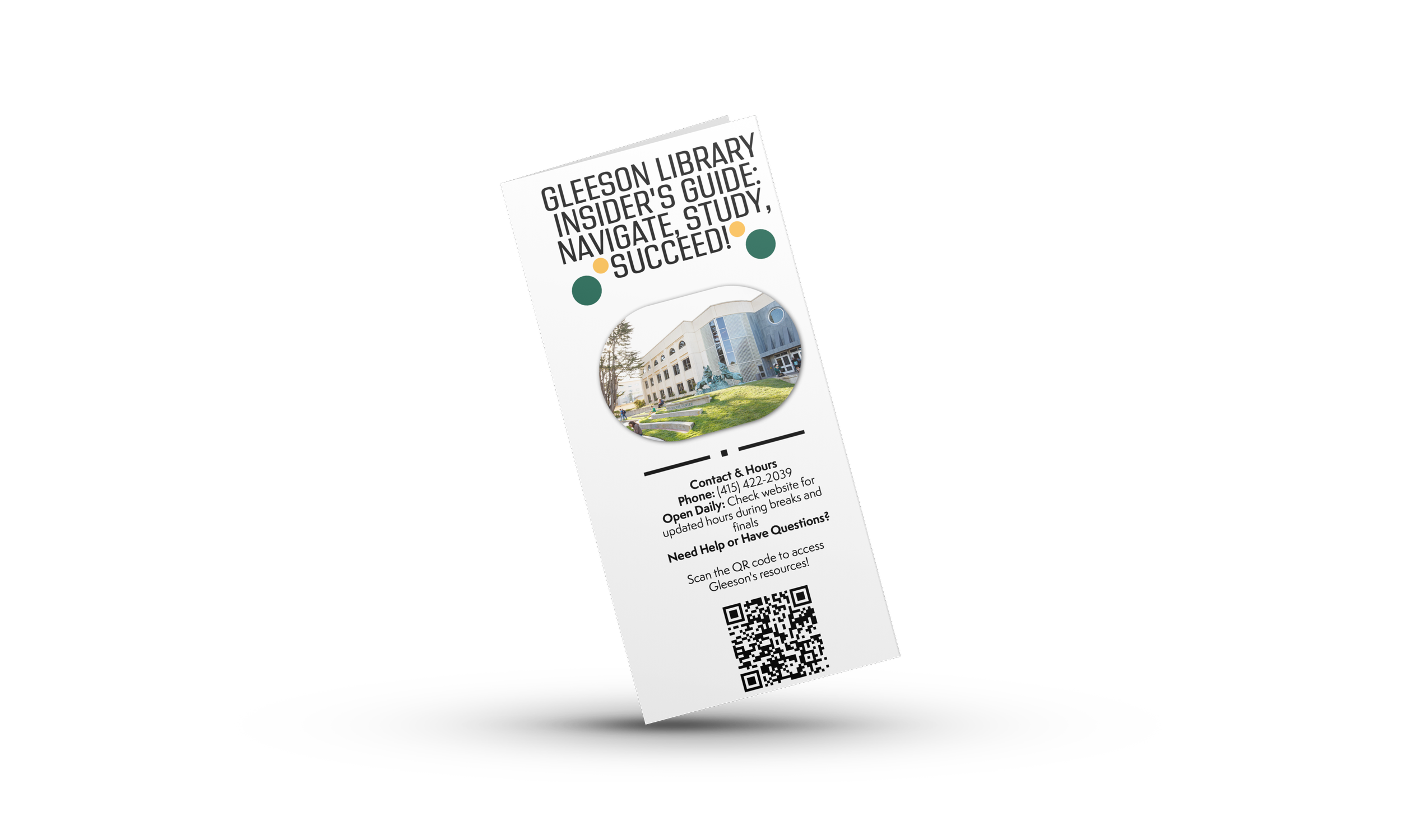
Gleeson Library INSIDER’S GUIDE: NAVIGATE, STUDY, SUCCEED!

Over the summer I was honored to create the Gleeson Library Pamphlet from a senior student perspective of how to navigate Gleeson quickly and confidently. Written in clear, friendly language, it highlights the essentials students actually ask about: where to find study spaces, how to borrow and renew books, printing and tech help, research support, and after hours access. Designed to be both practical and welcoming, the pamphlet functions as a pocket-sized companion for new and returning students. The goal was simple: reduce confusion, ease first-day anxiety, and help students spend less time searching and more time studying.
SUMMER- 2025
STUDENT PAMPHLET
ADOBE INDESIGN, ADOBE EXPRESS

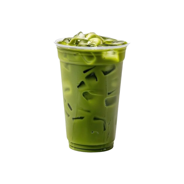
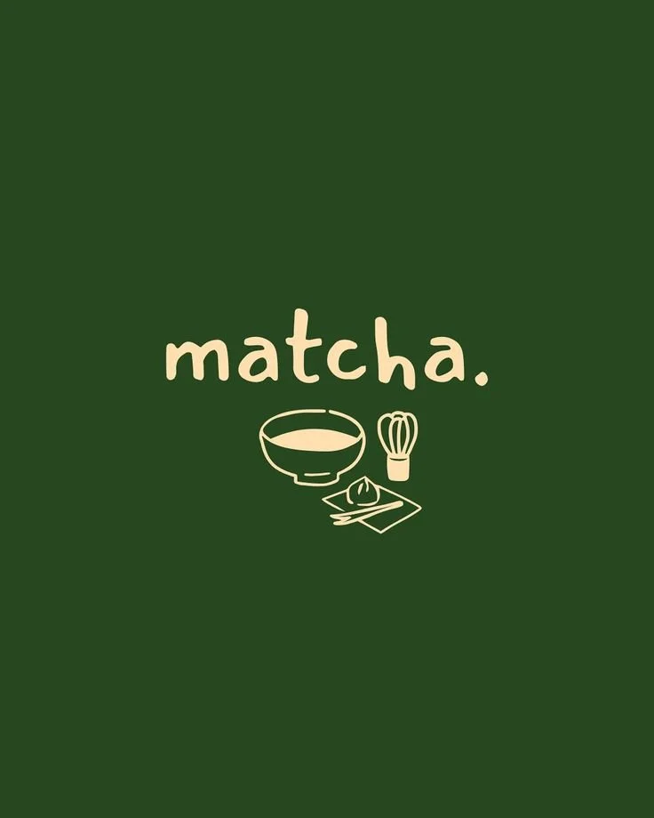
MATCHA MATCH APP
FALL 2025
UX/UI APP
FIGMA
Matcha Match is the first UX/UI iOS app I designed and developed, inspired by the idea of creating meaningful connections through shared interests and experiences. The app combines modern dating features with San Francisco’s matcha culture, allowing users to create personalized profiles, connect with like-minded people, and message potential matches through an engaging and user-friendly interface. To make the experience feel more intentional and interactive, users can also discover local matcha cafés and spots throughout San Francisco to plan their first date. Through this project, I explored user-centered design, wireframing, prototyping, and visual storytelling while creating an app experience that feels both social and relationship-focused.
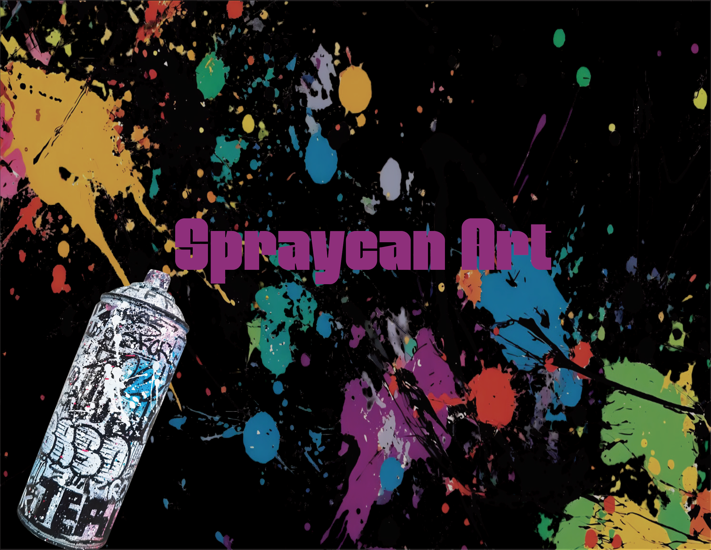
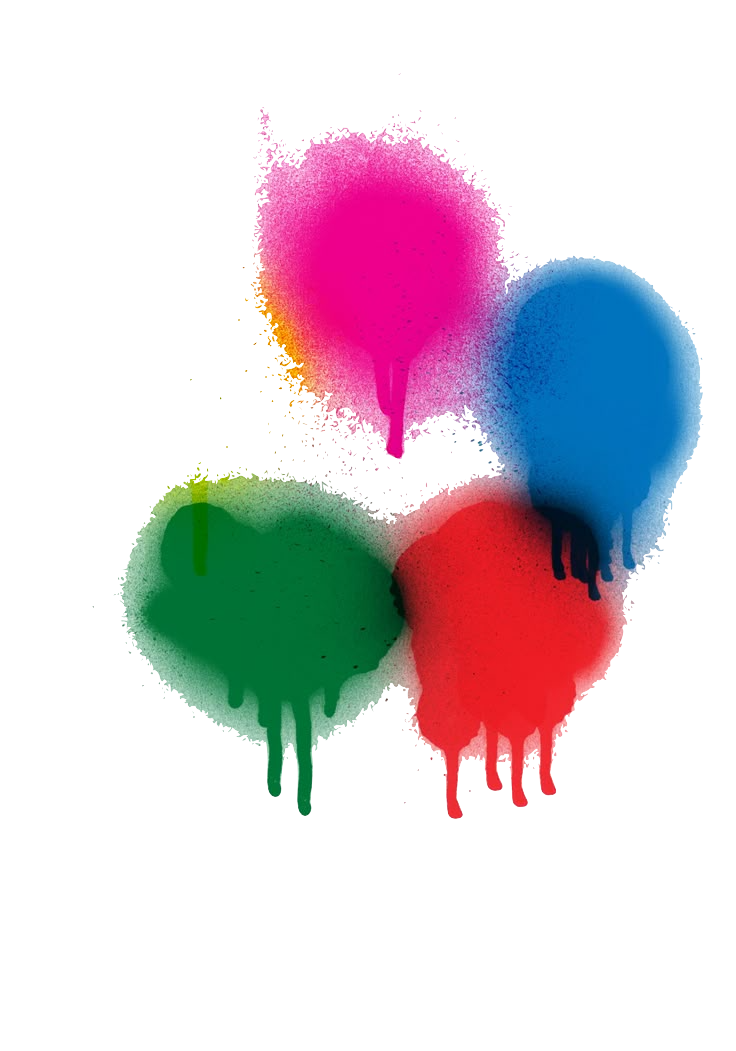
SPRAYCAN ART BOOK
SPRING 2026
PUBLICATION BOOK ( 33 PAGES, 8.5 X 11)
ADOBE PHOTOSHOP, ADOBE INDESIGN
For this publication project, I created a fun and visually expressive book centered around graffiti culture, something I’ve always been deeply inspired by. I’ve always felt that graffiti doesn’t get enough recognition for the amount of creativity, detail, and storytelling that goes into it. Using text from Spraycan Art by Henry Chalfant as inspiration and reference, I photographed every image featured throughout the book to create an authentic and personal visual narrative. Beyond the design itself, I fully produced the book by printing and hand-binding it into a hardcover format. For the cover, I spray-painted muslin fabric and glued it onto the hardcover to give the piece a raw, textured feel that reflects the energy of graffiti culture. The final publication was designed in a landscape format and finished with a French binding technique, exposing both the pages and interior structure of the book as part of the overall design experience.